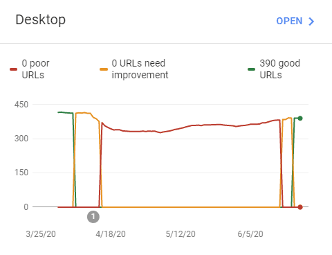
On the first summer day of this year I surfed in on the Google Search Console[a] and saw that the God-machine in Sunnyvale had declared this humble blog to be unworthy.

The issue that plagued all my pages in the desktop version was a very high cumulative layout shift (CLS). That is, a lot of page elements were moving around while the page was loading, making it a poor experience for the user. Together with largest contentful paint and first input delay, cumulative layout shift make up the Core Web Vitals[b], a new set of user-centric metrics that Google rolled out to quantify the quality of websites and thus provide a signal to Google's ranking algorithm.
In particular, what caused Google to cast me beyond the pale was the masonry-style layouts that I have on many pages to display photos. Since neither HTML nor CSS have a built-in masonry layout, I've implemented it using JavaScript. But this causes a lot of content to shift during the page initialization - the photos are laid out in a single column by the browser, and then the JavaScript takes over and turns them into a masonry layout.
CLS doesn't apply when the movement of elements is caused by user input. But in order to combat elements jumping around on the page as it loads, loading the page is not considered to be "caused by user input", and this is what caused problems for my pages. The solution I ended up with had three components:
Inline CSS styles: I added
overflow-y: scrollto the body element in order to have a permanent scrollbar which makes the width of the page predictable.Fixed-size elements first: The fixed-width right sidebar on the page loads before the horizontally growing main article, but is laid out to the right of it by using a
flexboxlayout with reverse order.Inline load-time masonry layout: As each image loads, there is a snippet of inline JavaScript to move the element into the right position.
It was the last component - inline load-time layout - that took the longest to figure out. CLS is computed as amount of shift times area affected. What this means is that each shifted element affects itself and elements below it in the document flow. It also means that if an element is the last element in the flow, and it has size zero, it has no shift at all.
I ended up with two bits of JavaScript (and, of course, inlining the layout code): one just as the element is created, and one to finalize it:
<script>var layout = new LoadingMasonryLayout();</script>
<div id="new_div_0">
    <script>layout.beginElement(document.getElementById("new_div_0"));</script>
    ...
</div>
<script>layout.endElement(document.getElementById("new_div_0"));</script>
This way, each element could be moved into its approximately final position in the page as the page was loading. The beginElement() call would do the actual moving of the element, since it had to be done while the element didn't have any size. The endElement() call would be able to read the size of the fully-constructed element and therefore update the layout object so that the next masonry "brick" could be accurately positioned.
Update 2020-06-23: It seems like the God-machine has taken this blog back into its mercy.
1. Detailed Explanation
The basic idea is this: the browser loads the page, and as it loads each masonry "block", for our purposes it goes through three steps:
-
The block element starts:
<div id="my-element"> -
The contents of the block element is loaded:
<div id="my-element">Hello World! -
The block element ends:
<div id="my-element">Hello World!</div>
The observation here is that if we move the element after step 3, we get a CLS penalty. That penalty can be for the element itself, or for it and any other element that the browser has to move as a consequence of the first element moving. The CLS score goes up.
Same goes for moving it after step 2. But, right after step 1, we can move it as much as we want at zero CLS cost, because (a) the size of the element is zero (it's just an opening tag), and (b) there is no "other element" affected by us moving it, because they haven't loaded yet:
<div id="my-element"><script>
var el = document.getElementById("my-element");

// Move the element as much as you want.
// It has size zero and no elements following
// it, so it doesn't add to the CLS.
</script>
With that out of the way, let's look at what the masonry layout does. In short, it first figures out how many columns it has to play with and how wide they are. Then, on init and on resize, it goes through all elements that it should place (the masonry blocks). For each column, it keeps track of how many pixels it has used, so for three columns, for example we start with used=[0, 0, 0]; Then for each element it picks the column that's least used and places the block there, and updates the number of pixels used. So:
for (block in blocks) {
    // Part 1: move the block
    //
    // Figure out which column
    // to place the block in. It's
    // the one with the lowest
    // value in the "used" array.
    var column = getLeastUsedColumnIndex();

    // Use CSS positioning to move
    // it there.
    block.style.left = getColumnLeft(column);
    // Place the block below all previous blocks
    block.style.top = getColumnUsed(column) + "px";

    // Part 2: update space used in column
    used[column] += block.offfsetHeight;
}
This works fine when the page is already loaded, but causes the CLS to go up when it is done on page load.
Let's combine the two. We have a place where we can move the block as much as we want - let's use that to move the block to the right place on the page. We can do all of Part 1 above.
We can't do Part 2, because while we're moving the block it hasn't loaded so we don't know the height of the block. But that's OK, we can do that once the block has loaded. We're not moving anything anymore, so no CLS. Putting it all together, we get HTML that looks like this:
<script>
// Figure out number of columns and create an
// array of that size to track how much we've
// used in each column.
var pixelsUsedInColumns = [0, 0, ..., 0];

// This is once per masonry layout
</script>

<!-- Here come the masonry blocks -->

<div id="block-0"><script>
var block = document.getElementById("block-0");
// Figure out which column to use. It's the one in
// pixelsUsedInColumns with the smallest value
var column = ...;

// Move the block
block.style.top = ...;
block.style.left = ...;
</script>

... rest of the block content goes here ...
</div><script>
// The block has loaded, so let's update the number
// of pixels used
pixelsUsedInColumns[column] += block.offsetHeight;
</script>

<!-- And the next block. Repeat as needed. -->

<div id="block-1"><script>
var block = document.getElementById("block-1");
...2. Forced Synchronous Layout / Forced Reflow
Everything is not perfect, though. When we update the pixelsUsedInColumns array by adding block.offsetHeight, we access the offsetHeight property, which forces the browser to actually calculate that value. This is called a forced synchronous layout[c] or forced reflow. Sadly, there is nothing we can do about it, because we must know the size of each masonry block in order to avoid CLS. However, on a typical page on this blog the time spent doing synchronous layouts on page load is about 40 milliseconds, so the performance impact is negligible.